Corita Kent
1959-61
Serigraph
Image: 10 in. x 14 in.
Sheet: 11 1/2 in x 15 1/2 in.
Gift of Elena Prohaska
Corita Kent (1918-1986), known by her Catholic title, Sister Mary Corita, was an American nun and artist renowned for her silkscreen, serigraphy, and involvement in the Pop Art movement. Her work tested the boundaries of two-dimensional space and carried positive messages of love, tolerance, and harmony. Corita was an experienced artist who attended and taught at several art universities, such as the University of Southern California and the Immaculate Heart College.1
Throughout her career, her work shifted from religious imagery to socio-political commentary on present events, such as the Vietnam War, while still alluding to Catholic text and imagery. She is well known for her grandiose pieces Love (1985), a popular U.S. postal stamp design, and Rainbow Swash (1971), a painted gas tank in Boston, both proclaiming a positive message and displaying a rainbow design.2 Her work focuses on forms and use of vibrant, highly saturated colors.
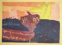
The work in the College’s collection is a serigraph titled Word Full's Destiny (1960). The artwork was donated to the College by Elena Prohaska, a collector of fine art and daughter of the artists Ray and Carolyn Pierson Prohaska, in 1985. The print depicts what appears to be a dove on a prominent blue backdrop. The text relates to the story of the Annunciation to the Virgin Mary when the angel Gabriel announced to her that she would be carrying the Son of God and the dove was often used as a symbol for the Holy Spirit in images of the scene.3 As per her typical work, there is a reference to scripture on the left of the piece, precariously placed overtop the painted background. Also common in her style is the emphasis on bright, near-garish color. The dove-like figure in the center of the composition is rendered in a calm, dark shade of purple, while the lower background is a deep, dark blue. The upper half of the print is rendered haphazardly in near eye-straining shades of pink, orange, and yellow in what could be defined as a sky. The text is presented in a contrast against the dark lower background, as the words are messily scrawled in light blue and varying shades of light pink.
The whole piece is rather scrambled in both composition and approach, as the blotches of color create a scratchy texture, perhaps in contrast to the fluid scripture. This is likely the result of the technique Corita used at the time, which was brushing a glue mix directly on the screen to stop some of the ink from printing onto the paper and creating a paint-like texture.4 The composition leans heavily on the left with nothing besides a splash of yellow to draw the viewer’s eyes towards the right. The print is also rather surreal, as it is near impossible to accurately define any of the shapes as any one object without close looking.
1.April Dammann, Corita Kent: Art and Soul: The Biography (California: Angel City Press, 2015), 10.↩
2. Ibid, 94.↩
3. Peter and Linda Murray, The Oxford Companion to Christian Art and Architecture (New York: Oxford University Press, 1996), 23-24.↩
4. Personal communication with Juliette Bellocq.↩
-Julianna Linder

